Please Read Before Placing The Order - We are wholesalers & we are offering Raw Materials for much less cost than Amazon. We cannot offer free shipping or any discount on shipping cost. Once your order is packed our team will reach out to you with exact shipping cost which needs to be paid seperatly based on the exact shipping cost as per final weight & dimension of package. Dispatch Timeline - 3 to 4 days minimum. Unboxing video is must to resolve missed item issue. Happy Candle 🕯️ Making.

Best Candle Color Combinations for a Beautiful Finish
Color is the first thing a customer notices about a candle, long before they smell it or light it. A well-chosen color palette can make a simple candle look premium, while a poorly matched one can make even a beautifully scented candle feel unfinished.
Finding the best color combo for candles is not just about picking shades you like. It involves understanding how colors work together, how wax type changes the final shade, and how much dye a candle can actually handle without affecting how it burns.
This guide walks you through the best candle color combinations for different moods, rooms, and occasions. You will also find practical guidance on dye usage, a color pairing chart, and answers to the questions candle makers ask most often about candle color mixing.
Why Candle Color Combinations Matter
Color shapes how a candle is perceived before anyone lights it. It sets expectations about the scent, the mood, and even the price point, which makes it one of the most powerful and most overlooked parts of candle design.
Warm colors such as red, orange, mustard, and terracotta feel cosy, energetic, and inviting. They tend to suit festive, spicy, and woody candles.
Cool colors such as blue, teal, green, and lavender feel calming, clean, and fresh. They work especially well for bathrooms, bedrooms, and spa-style candles.
Neutral colors such as ivory, beige, grey, and charcoal feel minimal and refined. They pair easily with almost any other shade and suit premium and corporate gifting.
Combining colors across these groups, or sticking to different shades within a single group, gives you endless ways to build a collection that feels cohesive and recognizable.
Candle Dye Basics
Before you start experimenting with color combinations, it helps to understand how candle dye behaves. This matters for the final look, and it also matters for how well your candle burns.
Always use dye made specifically for candle making. Liquid dyes, dye chips, and dye blocks are designed to dissolve fully in wax and burn cleanly. Crayons and food coloring are not suitable, since they can clog the wick and leave the candle burning poorly.
Learn More: Best Essential Oil Combinations for Candle Making
Most candle dyes work at a very low percentage of the total wax weight, usually well under 1 percent. The exact amount depends on the brand and the depth of color you want, so follow your supplier’s dosage guide and start with less than you think you need. Too much dye can clog the wick and cause weak or uneven burning.
Add the dye to melted wax and stir until it dissolves completely, following the temperature recommended for your specific dye. Undissolved dye leaves specks and streaks in the finished candle.
Wax type also changes the final shade. Soy wax tends to give softer, creamier, slightly pastel tones, while paraffin usually produces more vivid, saturated colors. Dark shades in soy wax can also show frosting more clearly, so test your colors in the wax you actually plan to use.
Remember that wax looks darker when melted and lighter once it sets. Always judge the final color on a cooled sample rather than in the melting pot.
Mica powder deserves a special mention. It gives a lovely shimmer, but the particles can clog wicks when mixed throughout a burning candle. Use it for surface accents, decorative candles, and wax melts rather than blending it through the body of a candle meant for burning.
Candle Color Combination Chart
Use this chart as a starting point when you are experimenting with candle color combinations. It groups popular color families by how well they tend to pair together.
Color Family | Pairs Well With | Best Used For |
Warm earthy (terracotta, rust, mustard) | Cream, beige, deep brown | Living rooms, autumn collections, spice and woody scents |
Soft pastels (blush, mint, lavender) | White, soft grey, light yellow | Bedrooms, baby showers, floral and fruity scents |
Cool tones (teal, sage, ice blue) | White, grey, soft green | Bathrooms, spa-style spaces, fresh and oceanic scents |
Bold and vibrant (fuchsia, orange, cobalt) | Yellow, magenta, white | Festive and party candles, fruity scents |
Neutrals (ivory, taupe, charcoal) | Almost every color | Minimal decor, premium and corporate gifting |
Deep jewel tones (emerald, burgundy, navy) | Cream, gold accents, ivory | Festive gifting, weddings, woody and spicy scents |
As with any design guide, treat this chart as a helpful starting point rather than a fixed rule. Dye brands and wax types vary, so always trust your own test samples over any general guide, including this one.

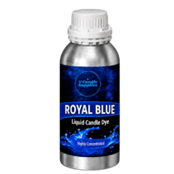
Candle Making Colors | Liquid Color Dyes – Royal Blue Color For Making Candles
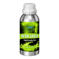
From ₹120.00 inc. all taxesSelect options This product has multiple variants. The options may be chosen on the product pageCandle Making Colors | Liquid Color Dyes – Neon Green Color For Making Candles
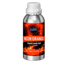
From ₹120.00 inc. all taxesSelect options This product has multiple variants. The options may be chosen on the product pageCandle Making Colors | Liquid Color Dyes – Neon Orange Color For Making Candles
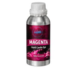
From ₹120.00 inc. all taxesSelect options This product has multiple variants. The options may be chosen on the product pageCandle Making Colors | Liquid Color Dyes – Magenta Color For Making Candles
From ₹120.00 inc. all taxesSelect options This product has multiple variants. The options may be chosen on the product page
Best Candle Color Combinations
This section covers six color palettes that consistently work well in candles. Each one suits a different mood, room, or season, and each pairing can be adapted to the dye and wax you already use.
Warm and Earthy Tones
Warm earthy shades create candles that feel grounded, cosy, and natural. They work especially well for living rooms, autumn collections, and candles with woody or spicy fragrances.
Detailed Pairings:
- Terracotta and Cream: Terracotta brings a warm, clay-like richness, while cream softens it and keeps the overall look light. This pairing feels modern and calm.
- Mustard and Burnt Orange: These two shades sit close together on the color wheel, creating a glowing, sunset-style palette that suits festive and autumn candles.
- Rust and Beige: Rust adds depth and warmth, while beige keeps the combination understated and easy to style in almost any home.
Soft Pastel Combinations
Pastel pairings feel gentle, fresh, and cheerful. They suit bedrooms, baby showers, spring collections, and candles with floral or fruity scents.
Detailed Pairings
- Blush Pink and Lavender: Soft pink and soft purple blend into a dreamy, romantic palette that works beautifully for gifting candles.
- Mint and Peach: Cool mint and warm peach balance each other well, creating a light, summery look.
- Baby Blue and Lemon Yellow: Pale yellow adds sunshine to a soft blue base, producing a bright, playful combination for spring and kids’ candles.
Cool and Calming Palettes
Cool shades create a clean, peaceful look that suits bathrooms, bedrooms, and spa-style candles with fresh or oceanic fragrances.
Detailed Pairings:
- Teal and Sage Green: Teal adds depth while sage keeps the palette soft and natural, making this a popular choice for botanical-style candles.
- Ice Blue and White: A very pale blue paired with white creates a crisp, airy look that suits marine and linen-inspired scents.
- Lavender and Grey: Soft purple and light grey create a quiet, modern combination that feels relaxing and refined.
Bold and Vibrant Combinations
Bright, saturated pairings grab attention on a shelf and suit festive candles, party favors, and fruity or tropical fragrances.
Detailed Pairings:
- Fuchsia and Orange: Two energetic shades that sit close together create a lively, tropical look with a lot of shelf appeal.
- Cobalt Blue and Yellow: Cobalt blue and sunny yellow create strong contrast and a playful, high-energy finish.
- Emerald and Magenta: Deep green and bright magenta make a rich, jewel-like pairing that feels bold and celebratory.
Neutral and Minimal Palettes
Neutral combinations feel refined and timeless. They are a strong choice for premium collections, corporate gifting, and modern home decor.
Detailed Pairings:
- Ivory and Charcoal: Warm ivory paired with deep charcoal gives a sophisticated, high-contrast look that suits layered or two-tone candles.
- Beige and Taupe: These two earthy neutrals sit close together, creating a soft, tone-on-tone finish that feels calm and elegant.
- White and Black: A clean, classic contrast that works well for geometric pillar candles and minimalist packaging.
Festive and Gifting Palettes
Festive candles often sell in large quantities for corporate, wedding, and seasonal gifting, which makes color planning especially important for wholesale orders.
Detailed Pairings:
- Red and Gold Accent: A classic festive pairing. For the gold, use a light dusting of mica on the surface rather than mixing it through the wax.
- Deep Green and Burgundy: Deep, rich shades that suit winter, weddings, and woody or spicy scented candles.
- Marigold Orange and Magenta: A vibrant, celebratory palette inspired by marigold and festive decor, popular for Diwali candles and gift sets.
Matching Candle Colors to Fragrance
Customers often expect a candle’s color to hint at its scent. A candle that looks like fresh lavender but smells like smoky oud can feel confusing, even if the fragrance itself is lovely.
Pastel pinks and purples suit floral scents. Greens and teals suit herbal and fresh scents. Warm oranges and browns suit spice, vanilla, and woody scents. Matching the two builds trust and makes your product line easier to understand at a glance.
How to Test a New Color Combination Before Making a Full Batch
Before committing a full batch of wax to a new color combination, always test on a small scale first. Colors can shift between the melting pot and the finished candle, so testing saves both wax and dye.
Melt a small amount of wax, around 50 to 100 grams, and add a small amount of dye. Pour a few drops onto a piece of white paper or into a small container and let it set completely before judging the shade.
Keep a record of the exact amount of dye you used for each sample. This lets you repeat a color precisely across batches, which matters a lot if you sell the same candle again and again.
Common Mistakes to Avoid When Mixing Candle Colors
Adding too much dye is one of the most common mistakes. More color does not always mean a better candle, since excess dye can clog the wick and cause poor burning. Build the shade slowly instead.
Judging color while the wax is still hot is another frequent issue. Melted wax always looks darker than the cooled candle, so wait until a sample has fully set.
Using too many colors in one candle or one collection makes the result feel chaotic. Two or three well-chosen shades usually look more professional than five competing ones.
Skipping a test batch when changing wax type is also common. The same dye can look noticeably different in soy wax compared to paraffin, so never assume a color will transfer exactly.
Key Takeaways
The best candle color combinations balance mood, scent, and the practical limits of dye and wax. Choose a palette with a clear purpose, add dye gradually, and always test a small sample before committing to a full batch.
For high-quality candle dyes, wax, and other candle-making supplies, check out V Candle Supplies. Our range of materials, available at both retail and wholesale quantities, will help you create beautifully finished candles that stand out on any shelf.
What is the best color combo for candles?
There is no single best choice, since it depends on the mood and room. Terracotta and cream, blush pink and lavender, and teal and sage green are three of the most popular and reliable combinations.
How much dye should I add to candle wax?
Most candle dyes are used at well under 1 percent of the wax weight. Follow your supplier's dosage guide and start with a small amount, since too much dye can clog the wick.
Can I use crayons or food coloring to color candles?
It is not recommended. Crayons contain ingredients that can clog the wick, and food coloring does not dissolve properly in wax. Use dye made specifically for candle making.
Why does my candle color look different once it sets?
Melted wax always looks darker than cooled wax, and different wax types change the final shade. Always check color on a fully cooled test sample.
Can I use mica powder in candles?
Mica works well for surface accents, decorative candles, and wax melts. Mixing it through the body of a burning candle is not recommended, since the particles can clog the wick.
Do candle colors fade over time?
Some dyes fade when exposed to direct sunlight over long periods. Store candles away from strong light and choose dyes with good light stability for candles that will sit on display.